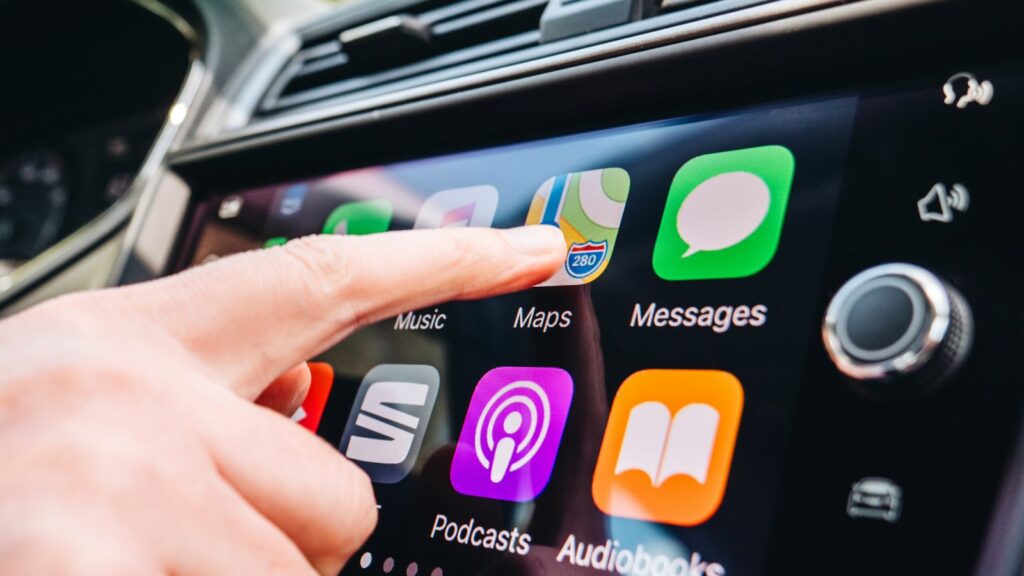
A glossy dashboard can look convincingly futuristic in a showroom, yet the impression often changes once the car is moving through rain, traffic, or an unfamiliar city. Drivers who once welcomed screen-heavy interiors are increasingly seeking models that retain knobs, switches, and clearly separated buttons for everyday functions. The concern is not nostalgia alone. It involves attention, tactile feedback, accessibility, reliability, and the simple need to operate a vehicle without studying its menus. These 12 reasons explain why physical controls are regaining support—and why many manufacturers are now reconsidering the idea that every cabin function belongs behind glass.
Touchscreens Often Require More Time Looking Away
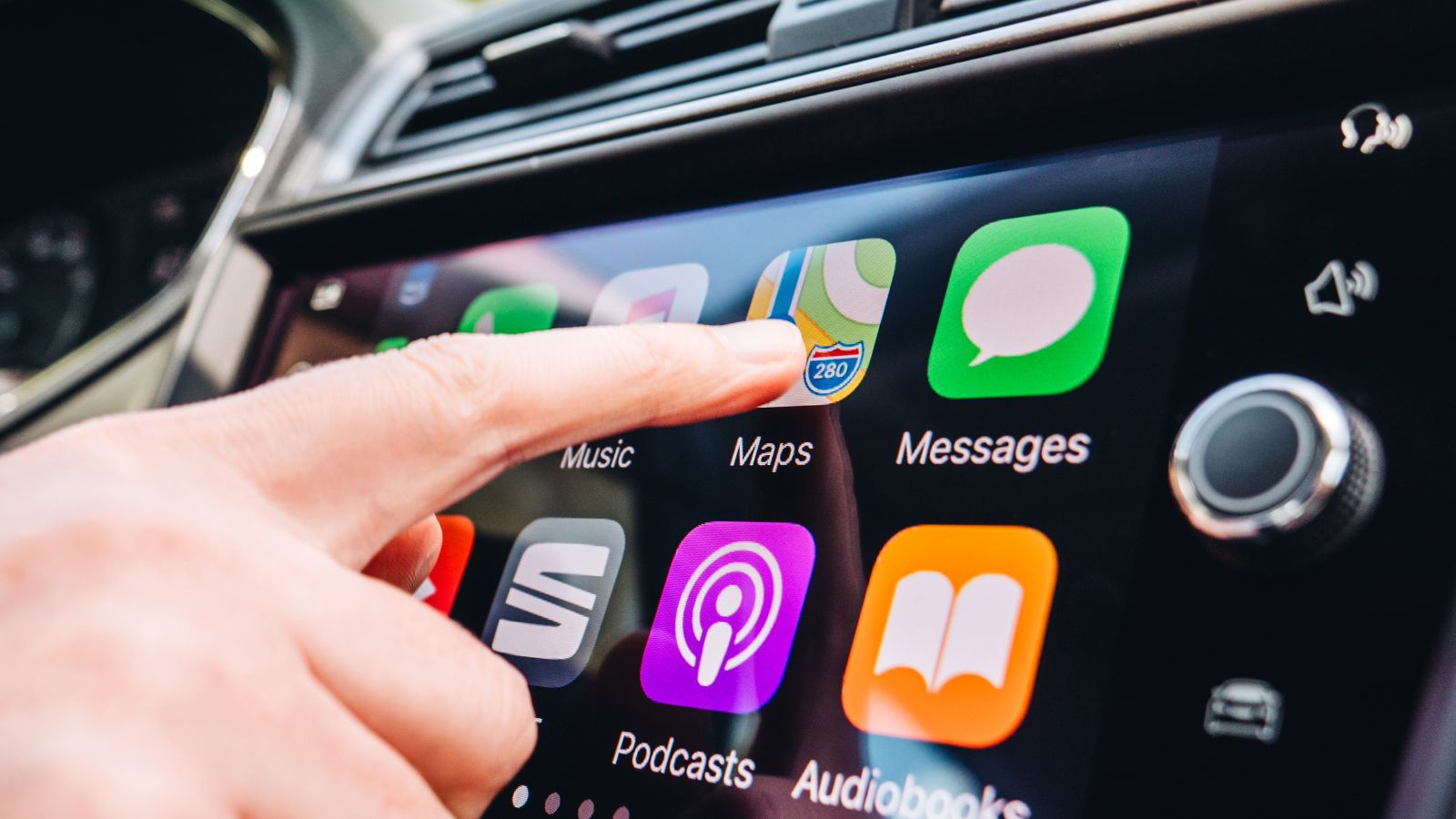
A touchscreen can display far more information than a traditional dashboard, but operating it usually requires visual confirmation. The driver must locate an icon, position a finger accurately, check that the screen registered the touch, and sometimes repeat the process. Research commissioned by the AAA Foundation examined infotainment systems in 30 model-year 2017 vehicles and found substantial visual and cognitive demand associated with ordinary tasks such as selecting music, making calls, and entering navigation instructions. Navigation programming was particularly demanding.
That extra attention can feel insignificant while a car is stationary. At road speed, however, even a short menu interaction competes with pedestrians, changing signals, merging vehicles, and sudden braking ahead. Simulator research has also found that touchscreen interaction can increase off-road glances and adversely affect reaction time and vehicle control. A dedicated knob does not eliminate distraction, but it can shorten the sequence: reach, turn, release. For many drivers, that simplicity matters more than the dashboard’s visual minimalism.
Tactile Feedback Reduces the Need to Search Visually
Physical controls communicate through shape, texture, resistance, position, and movement. A driver can distinguish a rotary volume knob from a flat defroster button before looking at either one. After repeated use, the hand begins travelling to the same location automatically. The click at the end of the movement also confirms that the command has been registered, without requiring another glance at a display.
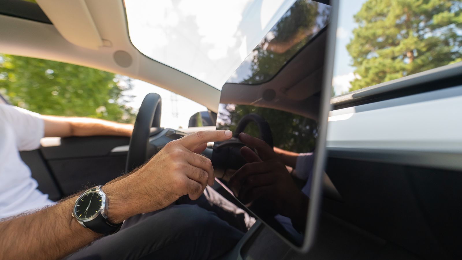
A flat screen offers fewer physical landmarks. Glass feels largely the same whether the finger is touching the fan control, a map icon, or an empty part of the display. Researchers working on future vehicle touchscreens have identified this absence of touch-based guidance as an important limitation, noting that conventional screens generally require visual focus. Haptic vibration can help, but a brief buzz does not always reveal which control was selected or how far a setting moved. That is why some drivers describe real buttons as calmer: the control confirms itself instead of asking the eyes to confirm it.
Frequently Used Functions Need Permanent Locations
Not every vehicle control deserves its own switch. A setting adjusted once every few months can reasonably live inside a digital menu. The argument changes for functions used repeatedly during normal driving. In a 2025 Dutch real-world study involving 30 drivers, turn indicators were used an average of 66.4 times per hour across the observed trips. Wiper-speed adjustments averaged 4.2 times per hour, while radio-volume changes averaged 2.2. Temperature adjustment was also among the most common actions in familiar vehicles.
These numbers help explain why drivers object more strongly when climate, volume, wipers, or lighting controls disappear than when obscure customization options do. A frequently used control benefits from a fixed position that does not change when another screen opens. Consider a commuter who lowers the volume at the same intersection each morning or adjusts the fan when the windshield begins fogging. A familiar knob can be found immediately. A digital control may first require closing navigation, opening a climate panel, and identifying the correct on-screen target.
Emergency Actions Should Not Be Hidden in Menus
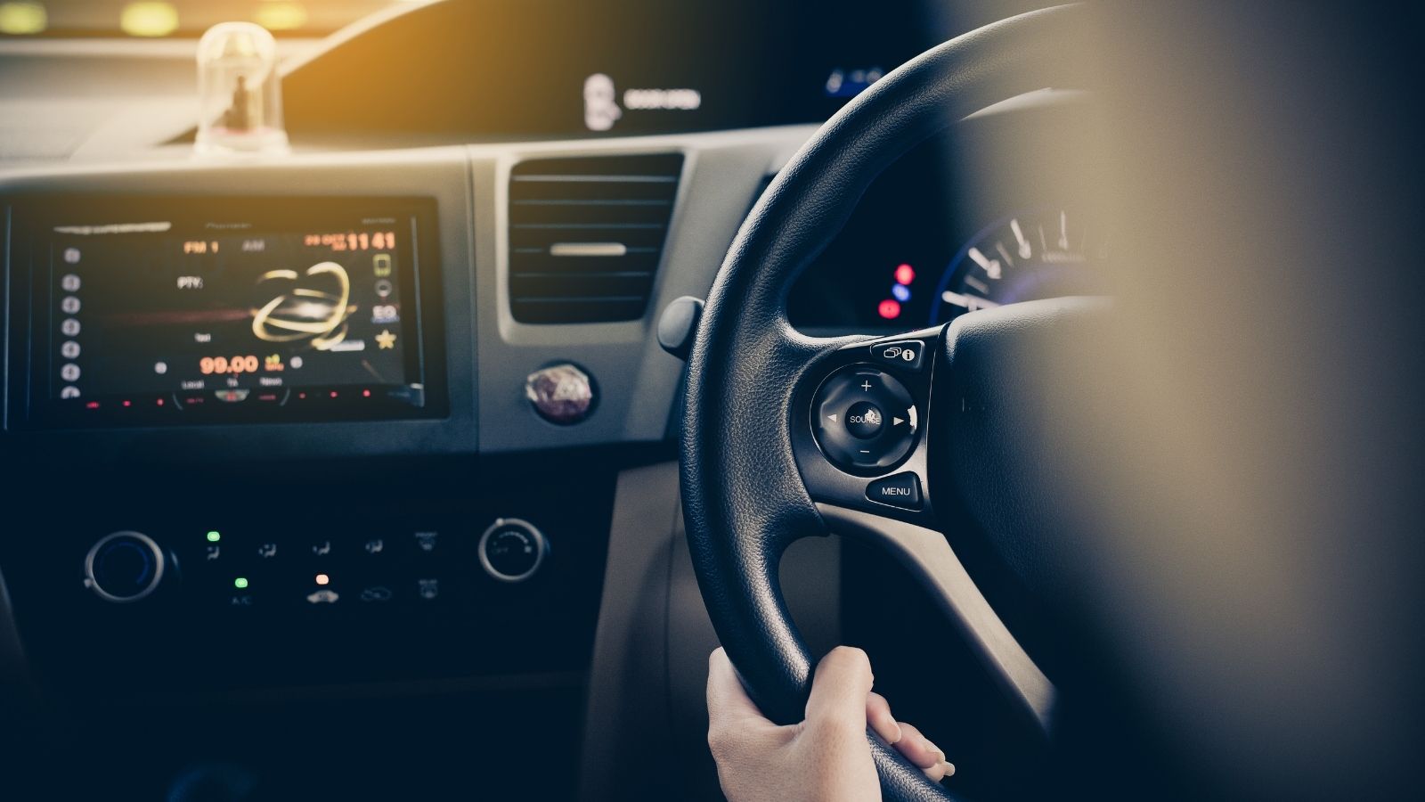
Some vehicle functions are needed rarely but must work immediately. Hazard lights may go untouched for months before suddenly becoming essential beside a stalled vehicle. The horn, indicators, headlights, and windshield wipers can also be required with little warning. In those moments, searching through icons is not merely irritating. It adds another task when the driver may already be managing poor visibility, fast traffic, or an unexpected obstruction.
Euro NCAP’s 2026 assessment framework reflects that concern. Its guidance asks manufacturers either to provide physical controls for important functions such as the horn, indicators, hazard lights, wipers, and headlights or to reserve a fixed, permanently accessible portion of the display for them. This is an incentive within a consumer safety-rating program rather than a legal ban on touchscreens. Even so, high safety ratings influence engineering and marketing decisions. The message is clear: essential controls should remain predictable and immediately available, regardless of which entertainment, navigation, or settings page happens to be open.
Road Movement Makes Precise Tapping Harder
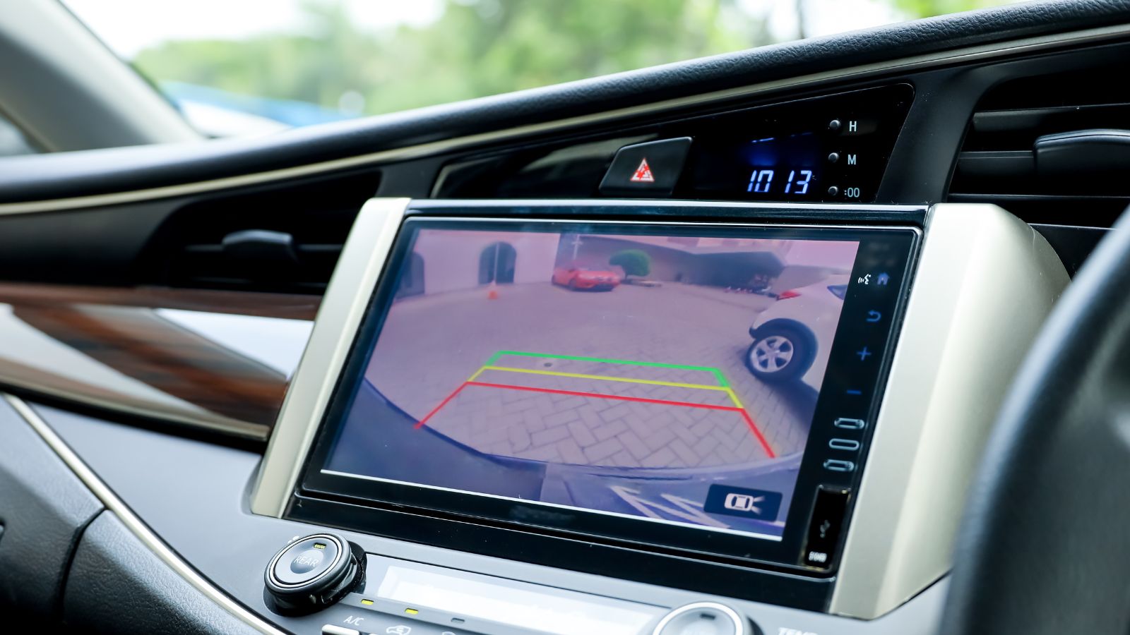
Touchscreens are usually demonstrated while a vehicle is parked on a level showroom floor. Real roads introduce potholes, expansion joints, cornering forces, braking, vibration, and body movement. Each disturbance can shift the driver’s finger just before it reaches a digital target. Researchers behind the FITS vehicle-interface project have specifically highlighted how vehicle acceleration and vibration can disturb finger movements and produce incorrect touchscreen inputs.
Screen design can reduce the problem by using large buttons, generous spacing, and stable layouts. One simulator study involving 30 drivers tested touchscreen targets ranging from 7.5 to 27.5 millimetres. Usability and driving-performance measures improved as targets became larger, with gains levelling off at roughly 17.5 millimetres under that study’s conditions. The finding does not establish a universal minimum, but it illustrates the trade-off. Large targets are easier to hit, yet they consume valuable screen space. Designers who try to display too many controls at once may end up creating smaller, harder-to-select icons precisely when the vehicle is moving.
Older Drivers Can Face Greater Interface Demands
Modern cabins sometimes assume that every driver is comfortable navigating layered digital interfaces. That assumption overlooks differences in vision, reaction time, dexterity, and familiarity with software conventions. An AAA Foundation study comparing younger and older drivers found that older participants generally took longer to complete in-vehicle information-system tasks and experienced greater cognitive and visual demand. Navigation programming and text-related tasks took more than 24 seconds on average for both age groups, while the burden was generally higher for older drivers.
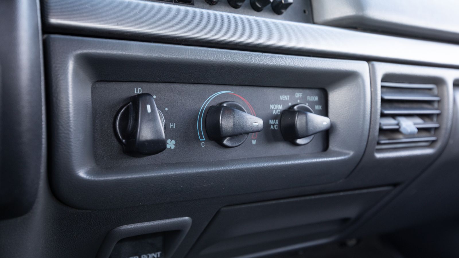
This does not mean older motorists cannot use modern technology. It means an interface should not make basic vehicle operation dependent on speed with icons, gestures, and menus. A retired driver replacing a ten-year-old car may suddenly encounter climate settings, audio controls, and driver-assistance options arranged like smartphone applications. A row of clearly labelled switches provides a more gradual learning curve. Physical controls can also help motorists with reduced fine-motor precision because a hand can brace against the panel and manipulate a distinct knob instead of attempting an unsupported tap on moving glass.
Unfamiliar Cars Expose Weak Interface Design

Owners often become proficient with an awkward interface simply because they use it every day. Rentals, borrowed vehicles, dealership demonstrators, and replacement cars remove that advantage. A control system that feels manageable after six months may be confusing during the first 20 minutes—the exact period when a driver is also learning the mirrors, steering response, braking feel, and vehicle dimensions.
The 2025 Dutch control-use study found that participants interacted less with functions in an unfamiliar car, suggesting they may have been regulating their workload. Researchers also observed difficulty with an unintuitive windshield-wiper control in the unfamiliar vehicle. Physical controls are not automatically understandable, but standard shapes and locations can create useful consistency. Drivers generally expect indicators near the steering wheel, hazard lights to have a prominent symbol, and volume to be adjusted with a knob or steering-wheel control. When every manufacturer invents a different digital pathway, moving between vehicles becomes an exercise in relearning tasks that once required almost no explanation.
Climate Controls Reveal the Everyday Frustration
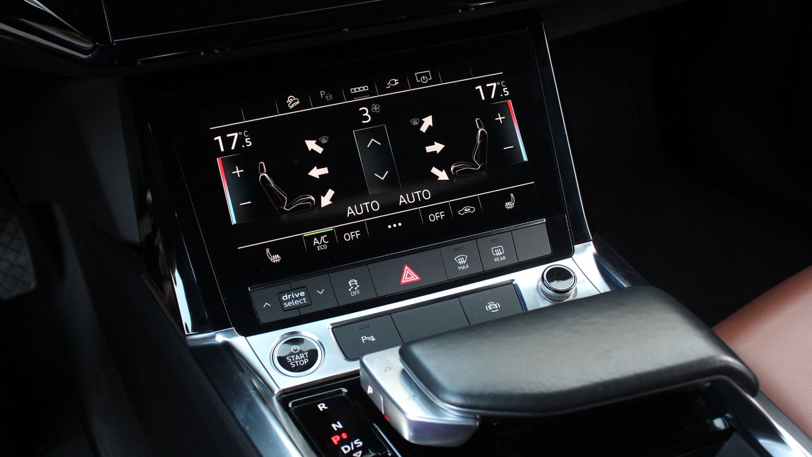
Heating and air conditioning may not sound technologically exciting, but they expose the difference between showroom design and daily usability. Cabin temperature changes with sunlight, passengers, clothing, humidity, and road conditions. Drivers may adjust fan speed several times during one journey. Visibility-related functions such as demisting can become urgent when moisture suddenly appears on the glass. Consumer Reports has therefore argued that physical controls remain preferable for frequently used features such as climate settings and volume.
The frustrating moment is rarely dramatic. It is the driver leaving an underground garage with the fan blowing too strongly, then discovering that the temperature panel has disappeared behind a phone-integration screen. It is a passenger asking for less heat while the driver negotiates a roundabout. Automatic climate systems reduce some interaction, but they do not eliminate preferences or rapidly changing conditions. Dedicated temperature switches, fan controls, and defroster buttons provide a direct response. They also remain available when the infotainment system is loading, displaying a camera image, or handling another task.
Digital Menus Can Turn Simple Actions Into Procedures
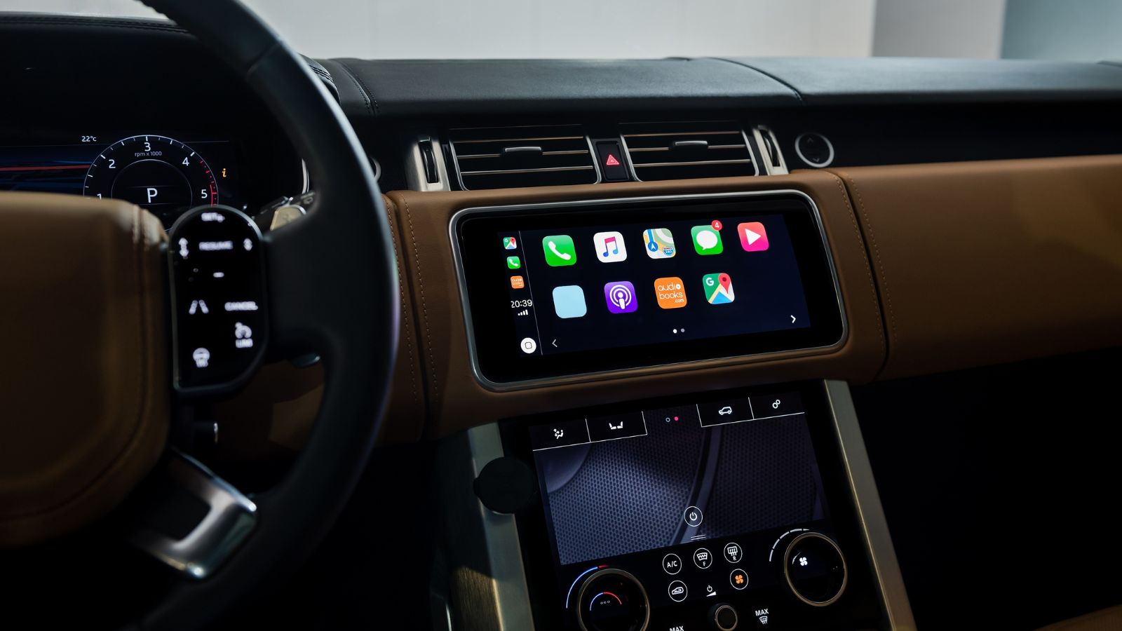
Screens became popular partly because they can accommodate an enormous number of features without filling the dashboard with hundreds of switches. The same flexibility can produce deep menu structures. A control that was once one movement may become a sequence involving a home screen, a settings category, a submenu, and a confirmation prompt. Research on vehicle interfaces has identified layered menus and increasing system complexity as potential sources of distraction.
The problem is not the presence of a screen. Maps, reversing-camera images, media libraries, energy-flow graphics, and detailed vehicle settings are often presented more effectively on a display. The concern arises when the screen becomes the only route to basic functions. NHTSA’s voluntary driver-distraction guidance encourages manufacturers to limit visually and manually demanding tasks while vehicles are moving. A well-designed cabin therefore separates information-rich activities from immediate driving controls. The map can remain digital, while fan speed, volume, hazards, and windshield clearing remain available through direct inputs that do not depend on navigating the map’s interface.
Customer Feedback Is Reaching Product Planners
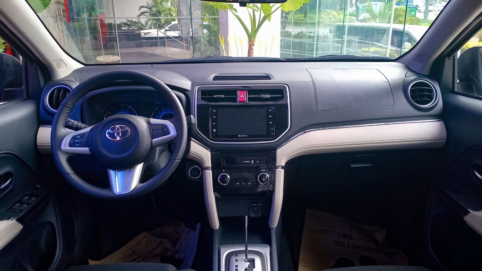
Driver dissatisfaction is no longer limited to online complaints. In a Which? member survey published in 2025, 56 percent of respondents regarded touchscreens as unnecessary, with some saying they were difficult or distracting to operate while driving. Consumer sentiment does not prove that every physical interface is superior, but it does indicate that large displays are not automatically perceived as progress.
Manufacturers have begun responding visibly. Volkswagen has said that the cockpit approach for newer electric models was shaped by customer feedback and would use an “intelligent combination” of digital and physical controls. Its newer interior concepts restore buttons and rotary controllers for commonly used functions while retaining central displays and modern software. This is significant because the industry’s screen-heavy phase was often marketed as an irreversible move toward the future. Customer reaction has shown that interface design remains a competitive issue. A buyer who dislikes touch-sensitive steering-wheel pads or screen-based climate controls may reject an otherwise appealing vehicle, giving automakers a financial reason to restore familiar hardware.
Touchscreens Still Have a Strong Business Case
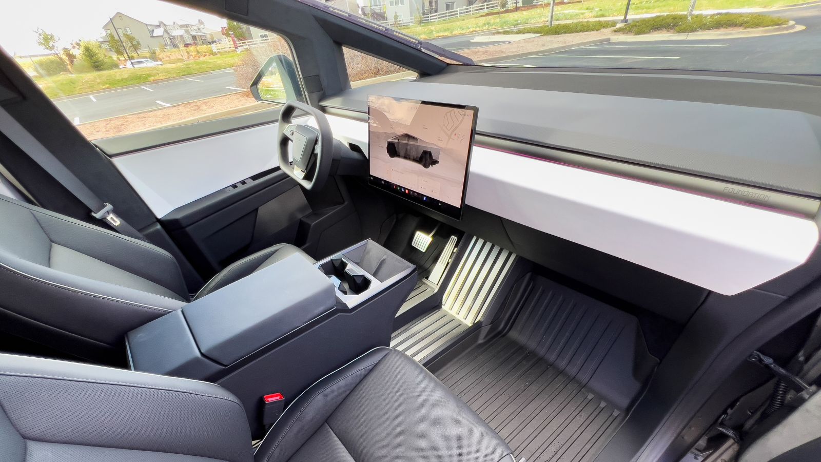
The rise of touchscreens was not simply a design mistake. A central display can replace numerous dedicated assemblies, reduce visible clutter, support different languages, and allow features to be reorganized or added through software. It also helps manufacturers create a consistent digital identity across several models. As vehicles become more connected, screens provide practical access to navigation, charging information, entertainment, driver-assistance settings, and subscription-based services.
That is why the return of buttons is likely to be selective rather than complete. Replacing every digital function with hardware would increase part counts, consume dashboard space, and freeze many controls in place for the life of the vehicle. The real debate concerns where the dividing line belongs. Drivers pushing back against touch-only cabins are not necessarily rejecting software, smartphone integration, or large displays. Many are asking manufacturers to stop treating the screen as the answer to every interaction. A useful display can coexist with a volume knob, temperature switches, steering-wheel buttons, and direct access to safety-related functions.
The Best Cabins May Combine Both Approaches
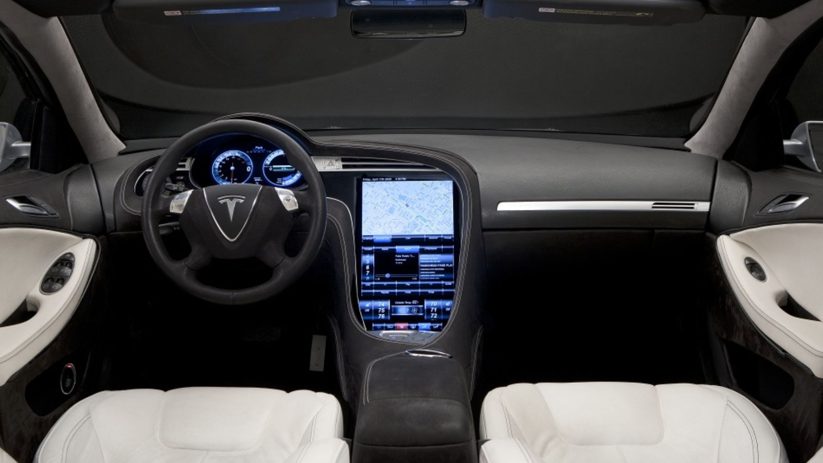
Evidence increasingly points toward hybrid design rather than a victory for either screens or buttons. A 2024 real-road experiment compared hardware-only, software-only, and combined hardware-software vehicle interfaces. Hardware interaction produced the smallest negative effects on driving and visual behaviour, while the combined interface offered strong usability with relatively low glance demand. A later research review covering 73 studies similarly concluded that touchscreens often performed worse than physical or voice controls for driving attention and secondary-task performance, although results varied by task and design.
The practical solution is to assign controls according to frequency, urgency, and complexity. Indicators, hazards, wipers, temperature, defrosting, and audio volume benefit from stable tactile inputs. Navigation maps, camera views, contact lists, vehicle configuration, and detailed information benefit from digital flexibility. Voice control can provide another option, but it should not be the only alternative when recognition fails or passengers are speaking. The return of physical buttons is therefore less a retreat from technology than a correction—one that treats driving as a physical activity rather than a stationary software session.
22 Things Canadians Do to Their Cars in Spring That Mechanics Hate

Spring brings relief to many Canadian drivers after months of snow, freezing temperatures, and icy roads that put serious strain on vehicles. As temperatures rise across the country, drivers begin washing cars, switching tires, and preparing vehicles for warmer weather and upcoming road trips. However, mechanics across Canada notice the same mistakes every spring when drivers attempt to recover from winter damage. Road salt, potholes, and harsh winter driving conditions often leave vehicles with hidden problems that drivers ignore. Some spring habits even create new mechanical issues that could have been avoided with proper maintenance. Here are 22 things Canadians do to their cars in spring that mechanics hate.

Alanna Rosen is an experienced content writer that focuses on many EV and educational content. Her articles are regularly published on Get CyberTrucked and syndicated on large publications.