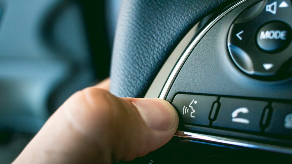
Modern cars can brake automatically, monitor blind spots, stream music, display live navigation and even watch whether the driver is paying attention. Yet the technology designed to make driving easier can sometimes make the cockpit feel unexpectedly demanding. A simple temperature change may require a screen tap, a warning tone may compete with navigation instructions, and familiar controls can move after a software update.
That concern matters because distraction remains a significant road-safety issue. In Canada, distraction was reported as a contributing factor in 17.8% of fatal collisions in 2023, although collisions can have multiple contributing factors. The debate is therefore becoming less about whether cars should have technology and more about whether that technology respects the limits of human attention. These 12 issues help explain why some drivers increasingly feel that new vehicles are asking them to process too much at once.
Touchscreens Are Taking Over Jobs Once Handled by Knobs
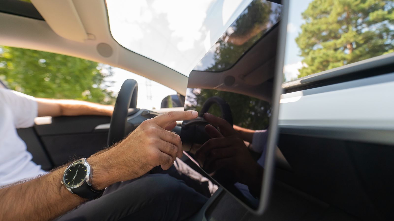
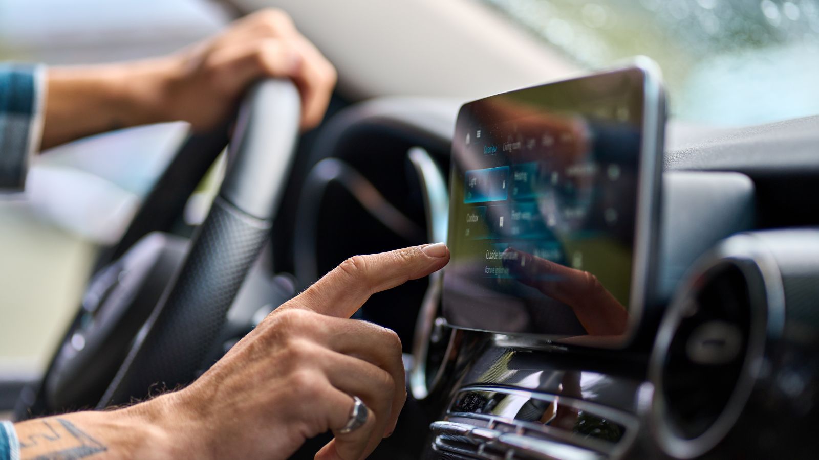
Touchscreens have transformed the appearance of vehicle interiors. A dashboard that once needed separate controls for audio, heating, navigation and vehicle settings can now place nearly everything behind one piece of glass. That creates cleaner-looking cabins and gives manufacturers considerably more flexibility to add features through software. The problem begins when functions needed during ordinary driving migrate onto the screen as well. Adjusting a setting can require a driver to locate an icon visually rather than simply reaching for a familiar switch.
A 2026 driving-simulator study compared physical and touchscreen controls for lighting, windshield wipers, indicators, hazard lights and climate functions. Across the tasks studied, touchscreen interaction produced greater visual distraction. When a task required more than a single interaction, researchers also recorded longer completion times and poorer measures of driving performance, including greater lane-position and speed variation. The lesson was not that every touchscreen is inherently unsafe. Rather, the evidence suggested that frequently used or time-sensitive driving functions can become unnecessarily demanding when designers make a screen the only practical route to them.
Simple Tasks Can Now Require Several Steps
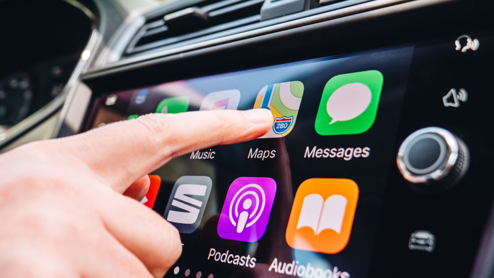
Much of the frustration with modern dashboards comes from something deceptively small: the number of steps needed to complete an ordinary task. Turning a traditional temperature knob requires one motion. A digital equivalent might involve waking the screen, opening a climate menu, choosing a zone and adjusting a virtual slider. Music, regenerative braking, head-up display settings and driver-assistance preferences can involve similar sequences. Each extra step may seem trivial in a parked car but feels very different when traffic is moving.
Research on in-vehicle interfaces has found that interaction complexity influences visual demand. Studies have shown that adding visual or visual-manual steps can increase the length of glances toward an interface. Consumer research points in the same direction. J.D. Power reported in its 2024 U.S. APEAL Study that 25% of owners blamed switching between audio sources for a poor audio experience, while 23% pointed to difficult menu structures. That helps explain why drivers sometimes describe a sophisticated new infotainment system as harder to live with than a simpler dashboard from a decade earlier.
A Two-Second Glance Can Matter More Than It Sounds
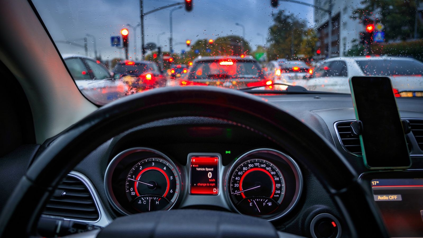
A driver looking toward a dashboard screen may feel as though only a moment has passed. Safety researchers treat those moments seriously because a vehicle continues covering substantial distance whenever attention leaves the road. Transport Canada recommends that visual-display tasks be designed so individual glances away from the forward roadway last no more than two seconds and that total glance time required to complete a task remain below 12 seconds. Similar thresholds appear in U.S. federal driver-distraction guidance.
Those limits help explain why badly designed interfaces can matter even when drivers never touch a phone. Research underlying the guidelines found that longer off-road glances are associated with increased crash or near-crash risk. The practical concern is not merely one dramatic, prolonged stare at a screen. Several short searches for a buried control can accumulate into a meaningful period during which changing traffic conditions receive less attention. On a familiar road with little traffic, that may pass unnoticed hundreds of times. The danger appears when a pedestrian steps out, traffic suddenly stops or another vehicle changes lanes during one of those seemingly harmless glances.
Flat Glass Removes the Advantage of Touch Memory
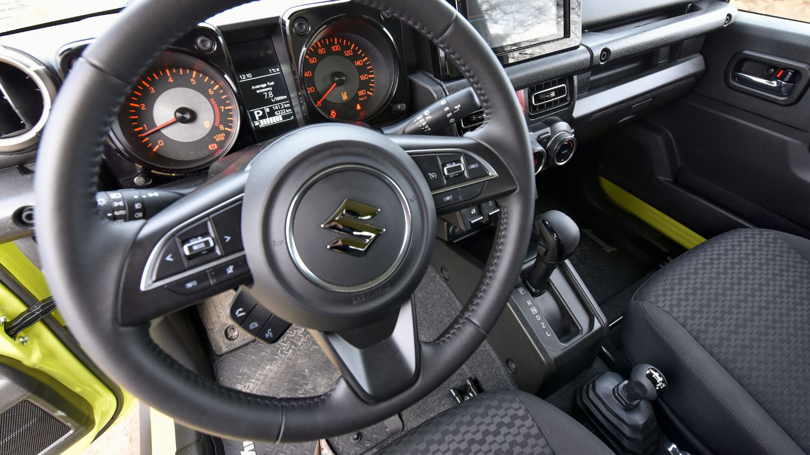
Physical controls offer an advantage that is easy to overlook until they disappear: a driver can often identify them by feel. A volume knob has an edge, a rocker switch has movement and a button occupies a fixed location. With familiarity, many adjustments can be made while maintaining most visual attention on the road. A smooth touchscreen offers far fewer physical landmarks, so the driver may need to confirm both where a control is and whether the desired command was actually registered.
Recent naturalistic research covering hundreds of thousands of vehicle trips found that physical buttons remained the most frequently used interaction method in the vehicles studied. Researchers noted that fixed controls can support haptic memory and potentially reduce visual demand for appropriate functions. Studies of touchscreen feedback have similarly found that adding tactile feedback can reduce visual workload in some circumstances. None of this means a dashboard covered with dozens of buttons is automatically superior; poorly arranged physical controls can also be confusing. The broader point is that tactile information gives designers another way to communicate with drivers without demanding continuous visual confirmation.
Climate Controls Have Become a Flashpoint
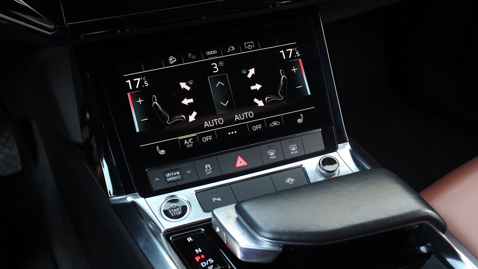
Few controls illustrate the debate better than heating and air conditioning. Cabin temperature, fan speed and windshield defogging may need adjustment while the vehicle is moving, particularly when weather changes quickly. Physical climate controls were traditionally designed for exactly that environment: prominent knobs or switches could be reached with little searching. Some newer vehicles instead integrate part or all of those functions into a centre touchscreen, occasionally requiring drivers to open a menu before reaching the desired setting.
Climate adjustment was among the functions evaluated in the 2026 study comparing touchscreen and physical controls. Its broader finding was that touchscreen operation increased visual distraction, while multi-action touchscreen tasks produced poorer task and driving performance than comparable physical controls. Other experimental work specifically examining climate-control interfaces has compared touchscreen operation with rotary knobs and buttons using eye tracking and workload measures. The concern becomes especially intuitive on a winter morning: clearing a fogging windshield should ideally feel like an immediate driving task, not like navigating a tablet. That is why climate controls have become one of the most visible battlegrounds in the debate over automotive interface design.
Phone Mirroring Solves Some Problems and Creates Others
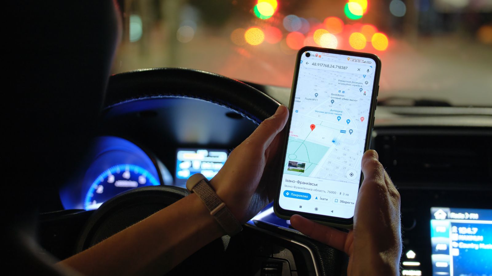
Apple CarPlay and Android Auto became popular partly because they replace unfamiliar manufacturer software with interfaces drivers already recognize from their phones. Navigation, music, calls and messaging can appear in a consistent environment regardless of vehicle brand. Owner-satisfaction research has even found higher infotainment satisfaction among drivers using CarPlay or Android Auto than among those relying only on their vehicles’ built-in systems. Familiarity, however, does not eliminate the attention required to operate those services.
A Transport Research Laboratory simulator study placed 40 regular CarPlay or Android Auto users through driving scenarios involving music, navigation, calling and messaging. Drivers generally performed worse while interacting with the systems than during the control drive, particularly when touchscreen input was used. Researchers recorded greater variation in lane position and following distance, along with slower responses to events ahead. Touch interaction also exceeded NHTSA glance criteria for most tested tasks. The finding is an important distinction: a cleaner interface can be easier than a poorly designed native system and still demand attention that would otherwise remain available for driving.
Voice Commands Reduce Eye Time, Not Mental Work
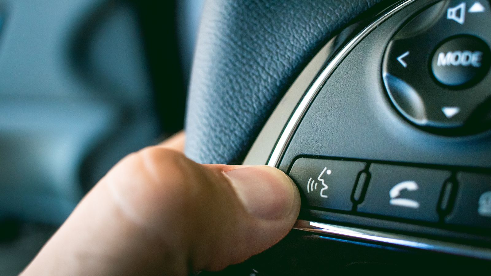
Voice control appears to offer the obvious solution to screens. A driver can request a destination, change a song or make a call without searching for an icon. Research generally supports the idea that well-designed voice interfaces can reduce visual and manual demands compared with touch interaction. That is valuable, particularly for simple commands. But the absence of a screen tap does not mean the driver’s attention is completely undivided. Listening, remembering prompts, formulating responses and correcting misunderstood commands all consume mental resources.
AAA Foundation research has repeatedly examined this cognitive side of distraction. Its work has found that hands-free interactions can still increase mental workload, slow responses and reduce awareness of information in the driving environment. The effect also depends heavily on what the system is being asked to do. A simple voice command to adjust climate settings can impose relatively little cognitive demand, while composing messages or navigating cumbersome dialogue trees can be considerably more demanding. Voice technology therefore works best as a way to simplify interaction—not as permission to turn the moving vehicle into a hands-free smartphone.
Safety Alerts Can Become a Second Stream of Information
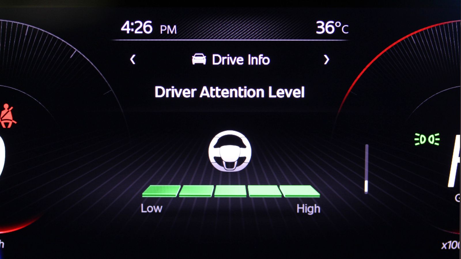
Many of the sounds competing for a driver’s attention are there for good reasons. Forward-collision warnings, blind-spot indicators, lane-departure alerts and speed warnings can help prevent crashes. The difficulty is designing those systems so important warnings remain meaningful. A car that frequently beeps during normal driving can create a kind of background noise, and drivers who regard alerts as unnecessary or irritating may eventually tune them out or disable the feature altogether.
Research from the Insurance Institute for Highway Safety demonstrates that acceptance is strongly influenced by alert design. Earlier IIHS work found relatively low use of some lane-warning systems when drivers considered the alerts annoying. More recent research showed significant improvement: lane-departure warning and prevention systems were active in 87% of nearly 2,400 vehicles examined, compared with 51% in a similar earlier study. Haptic warnings such as steering-wheel or seat vibrations have generally been better accepted than persistent audible alerts. The distinction matters. Safety technology can reduce risk, but if every routine event triggers another chime, the vehicle may inadvertently train its owner to distrust the very warnings that deserve attention.
Driver-Monitoring Systems Show the Trade-Off Clearly
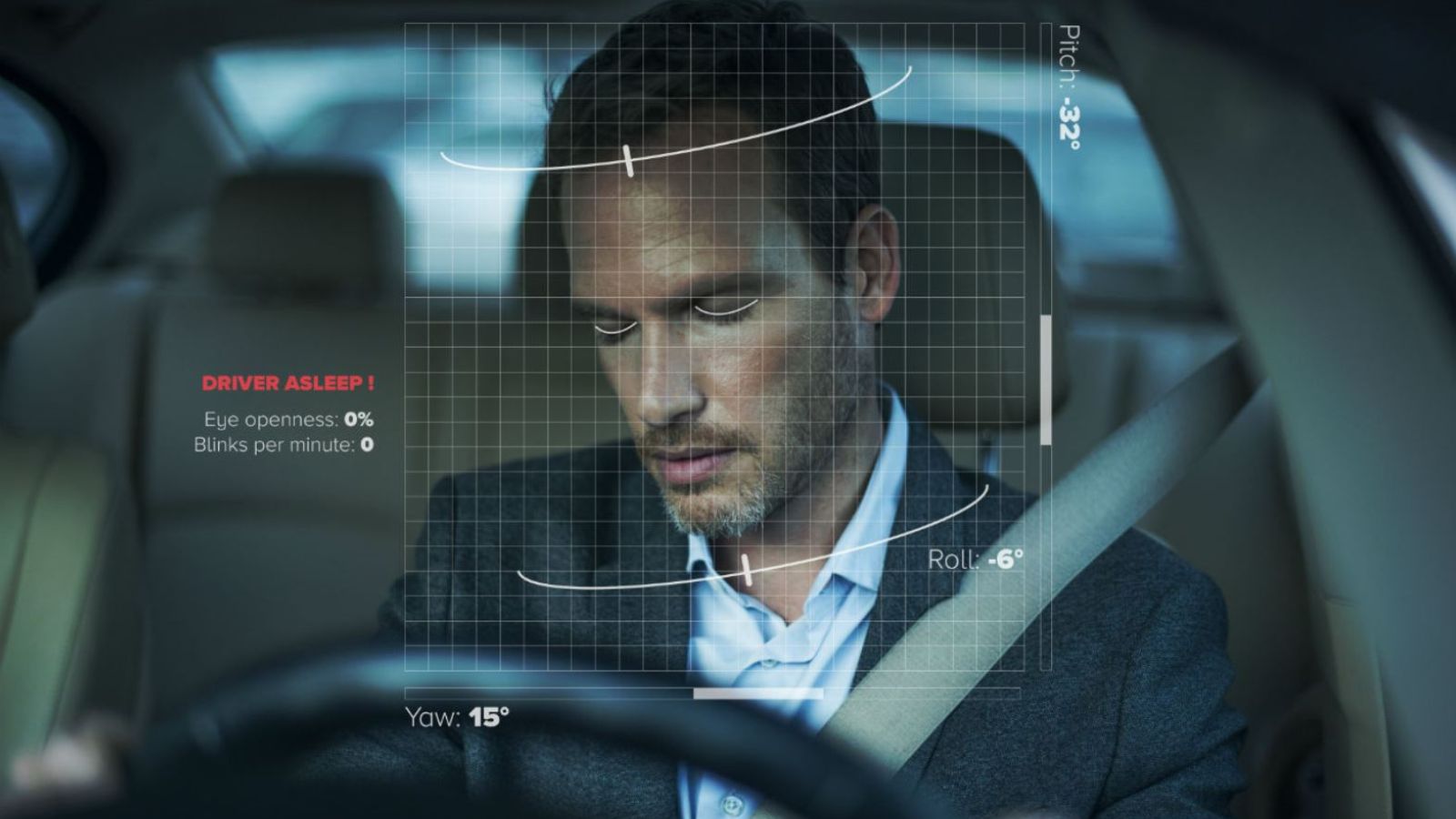
Some new vehicles now watch the driver as closely as the driver watches the road. Camera-based monitoring systems can detect prolonged glances away from traffic, signs of drowsiness or insufficient attention while assistance features are operating. These systems represent technology being used specifically to fight distraction. Yet they also reveal the delicate balance manufacturers face: a warning must occur often enough to change unsafe behaviour without appearing so often that drivers perceive the system itself as intrusive.
A 2026 Journal of Safety Research study examined responses from 3,475 U.S. owners of Subaru vehicles equipped with the DriverFocus monitoring system. Eighty-seven percent said they used the system most or every time they drove, 70% wanted the feature in a future vehicle, and majorities of users believed it improved their safety or helped them avoid distractions. There was still friction. Some owners perceived alerts as false positives, and among the small 4% who disabled the system in their profile, excessive alerts and annoyance were leading reasons. The results illustrate why thoughtful calibration matters as much as adding another sensor.
Software Updates Can Change Familiar Controls Overnight
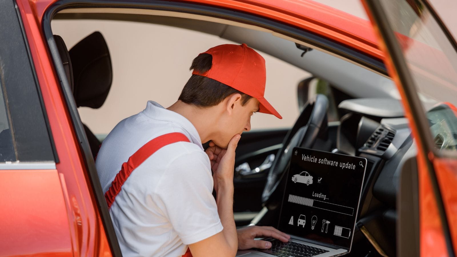
For most of automotive history, drivers learned a dashboard once. The location of the fan control or headlight switch remained the same until the vehicle was sold. Software-defined vehicles have changed that assumption. Over-the-air updates can improve features, repair bugs and introduce entirely new functions without a dealership visit. They can also rearrange menus or alter an interface that a driver has already learned through repetition.
A 2026 study offered a striking demonstration of the problem. Researchers made a relatively minor touchscreen change by switching the positions of two controls. After the change, participants initially took longer to complete the relevant task and made more long glances toward the screen. The effect highlights the difference between updating a phone and updating a moving vehicle: familiar control placement can become part of a driver’s learned routine. Automakers increasingly have the ability to improve an interface throughout a vehicle’s life, but that flexibility creates a responsibility to preserve consistency—or introduce changes in a way that does not unexpectedly demand extra attention behind the wheel.
Older Drivers Can Face a Heavier Interface Burden
A dashboard that feels mildly inconvenient to one driver can create substantially more workload for another. Vision, reaction speed, familiarity with digital interfaces and the ability to divide attention vary across the driving population. That makes universal usability particularly important in vehicles, where buyers may keep the same car for many years and where a confusing interaction can have safety consequences rather than simply causing frustration.
AAA Foundation researchers tested 128 drivers divided between ages 21–36 and 55–75 while they used infotainment systems in six 2018 vehicles. The older group took between 4.7 and 8.6 seconds longer, depending on the task, and experienced greater visual demand and slower responses. Navigation entry averaged 40 seconds for older participants compared with 31.4 seconds for younger drivers; selecting audio entertainment averaged 25.4 seconds versus 18 seconds. Researchers emphasized that the results pointed to a design challenge rather than an inherent problem with older drivers. Interfaces built around clarity, short task times and obvious controls can make vehicles easier to operate for virtually everyone.
Safety Ratings Are Starting to Reward Simpler Controls
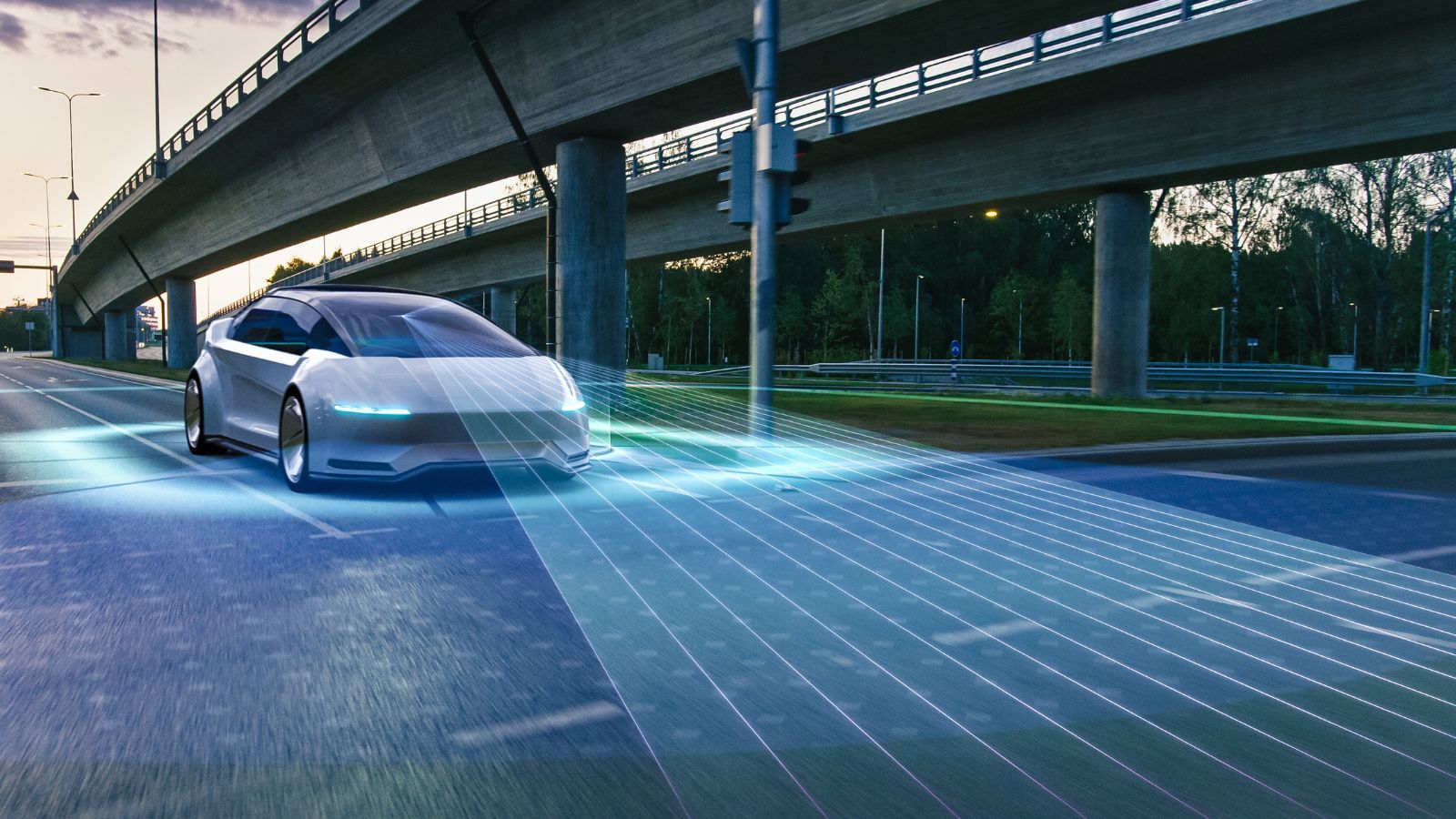
The pushback against distracting interfaces is no longer coming only from frustrated owners and automotive reviewers. Safety organizations are beginning to incorporate human-machine interface design directly into vehicle assessments. Euro NCAP’s 2026 testing protocols evaluate the placement, clarity and ease of use of important controls, with physical access to commonly used functions forming part of the assessment. The organization has explicitly argued that interface design should minimize the amount of time drivers spend looking away from the road.
Its detailed protocol goes even further. Depending on how frequently a function is used and how time-critical it is, Euro NCAP can require direct physical input such as a button, stalk, switch, pedal or rotary dial. Some menu-based touchscreen functions are limited to a maximum of two steps under its assessment framework. That does not signal the end of large displays or connected cars. Instead, it suggests the industry may be settling on a more balanced approach: screens for information-rich tasks, physical controls where immediate operation matters, and technology designed around the reality that the driver’s primary interface is still the road.
19 Used Cars Canadians Should Avoid in 2026 (Based on Owner Complaints)

Buying a used car in Canada can feel safe until repair bills start stacking up. Owner complaints tell a different story than glossy listings. Transmission failures, electrical problems, and weak winter reliability show up again and again in consumer reports. Many of these issues appear after warranties expire, when owners least expect them. Some vehicles look affordable upfront, but become expensive to keep on the road. Others struggle in cold weather, urban driving, or long highway commutes. Here are 19 used cars Canadians should avoid in 2026 (based on owner complaints).
19 Used Cars Canadians Should Avoid in 2026 (Based on Owner Complaints)

Alanna Rosen is an experienced content writer that focuses on many EV and educational content. Her articles are regularly published on Get CyberTrucked and syndicated on large publications.